Cybermen have changed significantly across their many appearances, even when they appear similar there are often small differences. I think it gives great variety for costuming, although a lot of effort is involved. When I was young my dad brought home large sheets of some plastic material with a chrome layer on one side. It was some sort of packaging for computer equipment and came as an enormous square bag several feet long in every dimension. But when I first had it my young imagination raced, because it seemed ideal for a Cyberman costume, and I was very keen on a Tomb-style, as these episodes had recently been released. The stumbling point was always the mask, they aren't easy to find and never cheap.
Mark I

The Tenth Planet style only had a single outing before a total redesign, but it's probably one that reflects the body-horror element of the cybermen the best, still being obviously part human. They rarely appear in other media either, though most notable in the audio Spare Parts, where their unique sing-song voices work very well. They still have flexible faces hidden behind fabric, and they are often described still having flesh hands though I've not seen an original colour set photo confirming this. The lack of a helmet seems to avoid some of the problems with the expense of other costumes but overall the costume has many fiddly parts, largely plastic sheeting with a cumbersome chest unit and probably a bit fragile for repeated wearings. I'm not aware of anyone dressing as one for a convention which is a shame.
Design - 6/10 - but only cosplay if you don't mind wearing a washing machine on your chest.
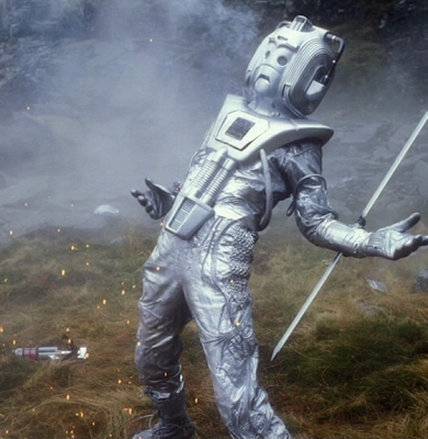
Mark II


A total redesign came for The Moonbase and reused in Tomb of the Cybermen. There might be a few differences in the positioning of the pipes but they are effectively the same. These are my favourite design from the moment I saw them in Tomb of the Cybermen. They appeared brutal and strong, with powerful three-fingered hands. They were made from some one-piece rubber wetsuit sprayed silver, as the paint kept flaking off during the filming of Tomb according to one interview. There's a bit of obvious use of practice golf balls at the shoulders and joints but otherwise they need to be largely custom made. The chest unit is smaller and more manageable but the helmet is difficult for the costumer. Expensive as it is, it's probably worthwhile buying one as it will be the centrepiece for the costume, the rest can be home made, even the chest unit, and pipes are easy to find. The Cybercontroller from Tomb is more straight forward as he does not have a chest unit but the head might be hard to locate.
Design - 9/10
Mark III

Wheel in Space cybermen are similar to the previous design but with several distinct differences. The pipes on the arms are replaced with rods and the chest unit is upside down while the helmet gains the memorable 'teardrop' design on the eyes. The hands are slightly different too, still three fingers but with metal caps on them. Same issues with acquiring a helmet present themselves and making the chest unit, and the arm rods are probably more difficult to make than the previous piping. I don't greatly care for the two-part costume, more obviously a wetsuit but probably more comfortable to wear, as far as comfort goes in such costumes.
Design - 7/10
Mark IV

All change again for The Invasion, some aspects of the Wheel design still present on with the two-piece wetsuit and the rods on arms and legs. New chest unit and I like the new head, but the use of the wetsuit is even more obvious as are the lace up boots on the feet. A bit of me likes it, a bit of me doesn't. I only got to see the Invasion recently with the DVD release, which is grand, so it doesn't hold a childhood nostalgia value. It's a memorable design though and would be a lot of fun to cosplay, if you could get the head. Fortunately, there seem to be more props of this head that come up for sale than the Tomb/Wheel version.
Design - 7/10
Mark IV

There was a huge gap until the next Cyberman story which hopped right over the Pertwee era which was a shame. They resemble the Invasion style but the heads are modified and the chest unit is reused again from Wheel, and it's been turned around again. Joints have a concertinaed sleeves and thick pipes are all over the costume. I don't really care for it, but maybe that's influenced by the fact the story isn't up to much. Also the cybermen strut around a lot with their hands on their hips (see above), it's all a bit silly.
Design - 6/10
Mark VI
Awesome redesign for the 80s, gone are are the wetsuits and now there is a far more complex looking RAF flight suit. The head and chest unit are done again and look fantastic. I think the cybermen became a lot more fluid and human in their movement with this design, and somewhat less robotic. The costume was used in Earthshock, Five Doctors and Attack of the Cybermen with minor modifications. In Earthshock the chin piece was clear revealing a little movement inside, but later on it was just painted silver. Attack of the Cybermen had one painted entirely black to hide in the sewers. The loose fitting suit is probably the best choice for a cosplayer, but getting hold of an accurate RAF suit is difficult and the head and chest unit are a costly purchase that probably can't be avoided. They do however look grand on screen and still look good over 20 years later. But I was never scared of them, not like those in the 60s.
Design - 8/10 - but is more difficult to home build than those previous.
Mark VII

The cybermen get a very shiny makeover for Silver Nemesis, this just look a bit glitzy and not particularly realistic. The story is god-awful with the cybermen's allergy to gold so strong that even lumps of it hitting them kills them outright. It's a sad 25th anniversary. Anyway, the head and chest unit are chrome, but also the plate in the middle is different inside. Pipes and wires are rearranged particularly around the wrists and shins, the RAF suit is replaced with some sort of more generic looking fabric, hands are the 'cricket glove' style. A lot of work for the costumer but at least the complex RAF suit is gone. The head is difficult to achieve unless you compromise on the chrome finish or have means to chrome plate something large. The original props in this story can be found in the hands of various collectors online and all have all discoloured with age turning a rather uncharacteristic gold colour for the cybermen.
Design - 5/10 - hate the chrome.
Mark VIII
And that was it for a long time through the 'wilderness years' with a few speculative designs for various aborted projects throughout the 90s like that of the "Dark Dimension". But the New Series came back and with it in the second series new Cybermen. Concept artists came up with all sorts of ideas for the new cybermen, some taking inspiration from the old, like the image below.

That is first class in my opinion. Heavy set, industrial, brutal and a mix of the old. A really lovely design. And there were a lot of other great looking designs. What we got was this...

Dreadful. Did someone really walk around the many designs and pick the shit bit from each, and then come out with something that looks like a damn toy? I really believe the 'action figure potential' was a factor in this design, because apart from the jug handle ears it does not evoke anything cyberman-ish to me and flares went out of fashion with Revenge of the Cybermen. I really hoped that we'd get a new design after the "parallel universe" shtick in the New Series but no, this is what out cybermen now look like in every story, probably because the costumes cost so damn much. It's all armour and very little to suggest they are organic in any fashion, they are as good as robots. It wouldn't be so bad, but seeing many pieces of the concept art just makes me think we lost out. The costume is nigh impossible for a cosplayer to adequately construct, I've seen someone making one from folded paper and card, but the investment to make something durable would be high.
Design - 2/10 - please get rid of it.
No comments:
Post a Comment